Hermes Foil Stamping Depth and Spacing: How to Read the Mark
A forensic guide to the letter height, kerning, foil adhesion depth, and character-level markers that distinguish authentic Hermès foil stamping from every counterfeit currently in circulation.
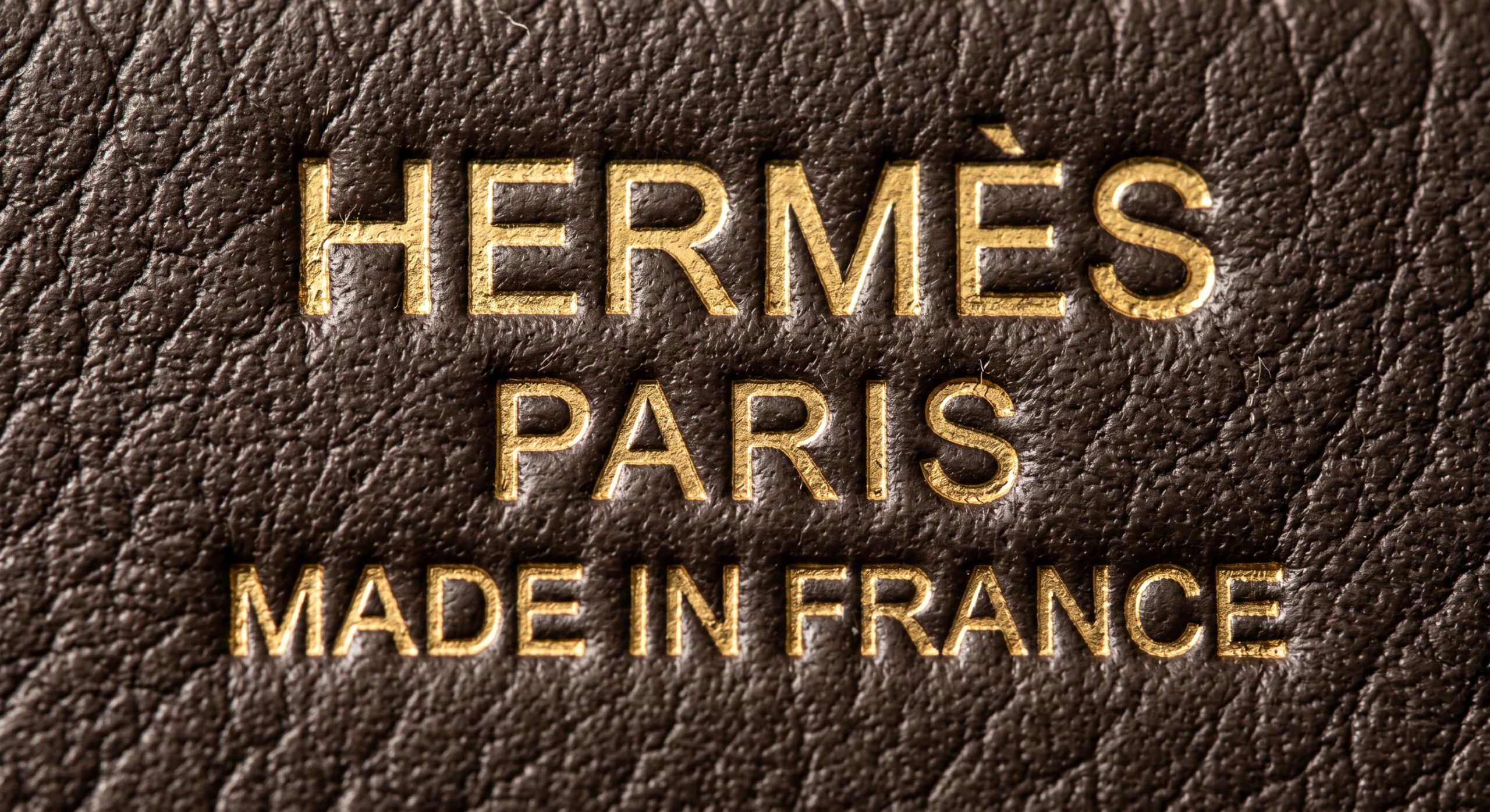
The Hermès foil stamping — the gold text reading "HERMÈS PARIS MADE IN FRANCE" pressed into the exterior leather — is one of the first things a buyer's eye goes to and one of the most frequently misread authentication markers at every tier of the secondary market. Most buyers look at whether the text is present and legible. Forensic authenticators look at something far more specific: the depth of the impressed letterform beneath the foil, the kerning consistency between adjacent characters, the adhesion quality of the gold foil at the letter edges, and the specific geometric properties of characters like the É and the R that Hermès's proprietary die produces in ways no commercial typeface replicates. These are the markers that separate authentic from counterfeit — not the presence of the text, but the material and geometric precision of how it was applied to the leather's grain surface.
This article provides a complete forensic reading of the Hermès foil stamp: how it is applied, which specific characters carry the most diagnostic information, how impression depth and foil adhesion quality are read under magnification, and how to conduct a systematic five-step inspection protocol that covers every dimension of the mark.
What Hermès Foil Stamping Is and the Process That Creates Its Authentication Markers
The foil stamp on a Hermès bag is produced by a hot-stamping process: a metal die engraved with the text in reverse is heated to a precise temperature and pressed against the leather surface with a sheet of gold foil between the die and the leather. The heat causes the foil's adhesive layer to activate and bond to the leather surface at the points of die contact, transferring the gold film in the exact shape of the engraved letterforms. When the die is lifted, the foil adheres only at the contact points — the letter shapes — leaving the surrounding leather surface clean.
This process produces three simultaneous physical effects that together constitute the authentication signature of an authentic Hermès foil stamp. First, the die compresses the grain surface and fibril layer beneath each letterform to a slight but measurable depth — setting the letters into a shallow depression that is legible under oblique light even on aged pieces where the foil has partially worn. Second, the precise temperature control during application allows the foil to bond to the leather with a specific adhesion quality at the letter edges — clean, sharp, with no bleeding or fraying of the gold film beyond the die boundary. Third, the proprietary die engraving used by Hermès for its specific letterforms produces character geometries that differ from any commercially available typeface, creating letterform-level authentication markers that are consistent across authentic pieces and consistently wrong on counterfeits. The Authentication Guide hub covers these stamp markers alongside hardware, stitching, and blind stamp authentication.
"Everyone looks at whether the text is there. Nobody looks at whether the É is correct. That is exactly why the É is the most reliable foil stamp authentication character on any Hermès bag."
Reading the Letterforms: The Specific Characters Where Counterfeits Fail
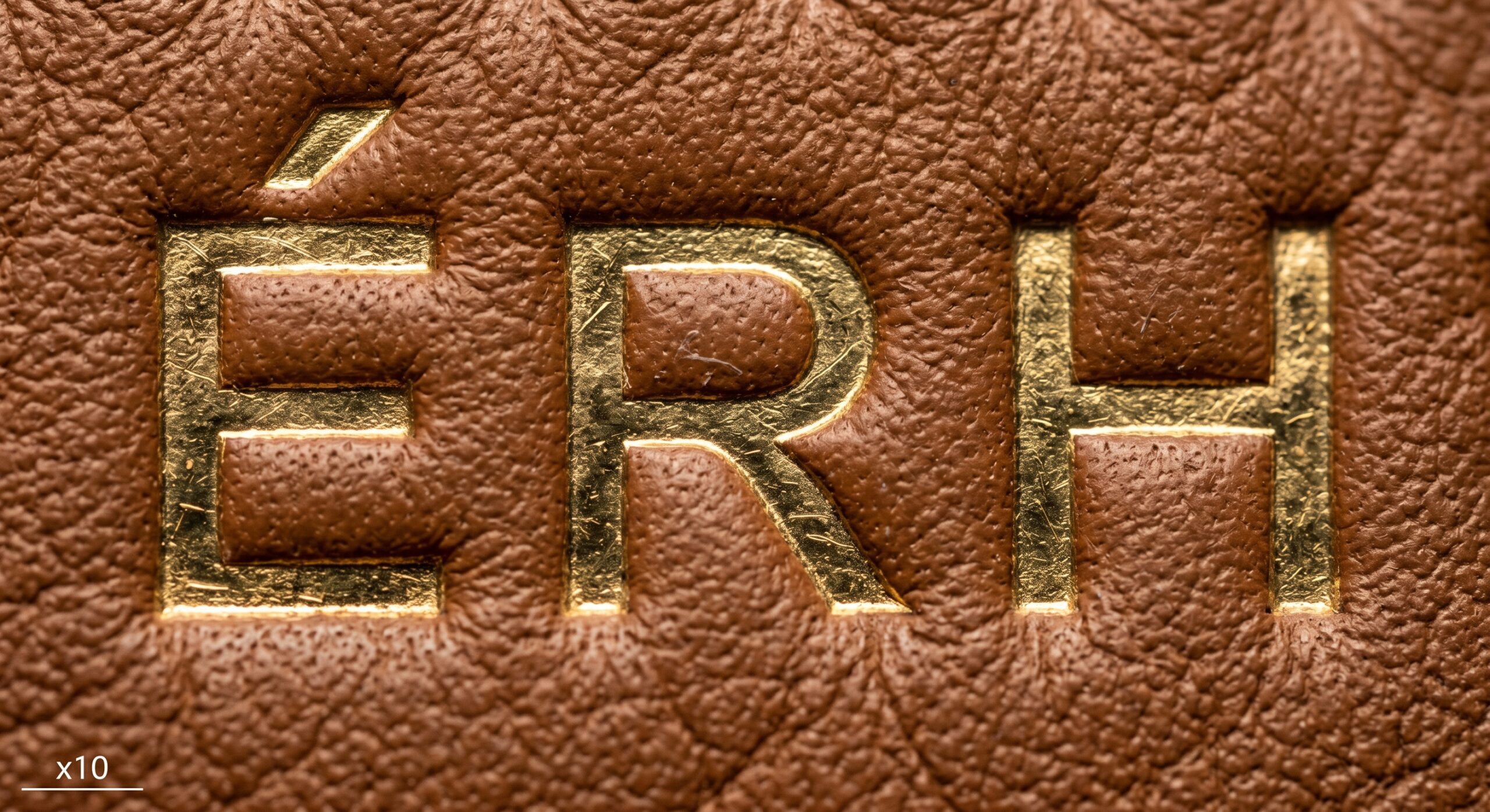
The foil stamp text uses a proprietary letterform set that Hermès has refined across decades of die production. While it superficially resembles a serif typeface in the broad roman tradition, specific characters carry geometric properties that distinguish authentic dies from any commercial or counterfeit replica. Six characters carry the highest diagnostic value — three from the word HERMÈS and three from the supporting text.
- É accent angle — authentic: precisely 45°, positioned above cap height without touching; the most commonly failed character on counterfeit stamps at every tier
- R leg extension — authentic: extends beyond the letter's right optical boundary at a specific angle; most counterfeits show a leg that is too contained or too steeply angled
- H crossbar — authentic: slightly above centre; counterfeits default to the standard centred crossbar position of commercial roman typefaces
- M vertex — authentic: descends to approximately 60% of cap height, not baseline-touching; extreme variants (too deep or too shallow) are the most common M failure on fakes
- Kerning across the full text line — authentic: even spacing between all character pairs with no crowded or gapped pairs; counterfeits frequently show inconsistent kerning that is most visible between the M-È and A-R pairs in HERMÈS
- Line spacing between "HERMÈS PARIS" and "MADE IN FRANCE" — authentic: consistent with approximately 1.5× the cap height between the two text baselines; counterfeits frequently show either compressed or expanded line spacing
Depth, Spacing, and Foil Adhesion Quality: The Physical Authentication Layer
Beyond the letterform geometry, the physical properties of how the foil stamp interacts with the leather surface carry substantial authentication information. This layer is often more accessible than letterform analysis for buyers without typography training — it requires only a loupe and oblique light rather than knowledge of specific character geometries.
Impression depth is the first physical property to assess. Hold the bag at a low angle to a single strong directional light and look across the foil stamp surface. On authentic pieces, each letterform sits in a slight depression — the compressed fibril zone created by the heated die. This depression is considerably shallower than the blind stamp impression but is consistently present and legible under this lighting condition as a slight shadow along the lower edge of each letter. The depth is consistent across the full text block — no individual letters sit deeper or shallower than their neighbours. A stamp with no depression at all (cold-foil transfer, common in lower-tier counterfeits) or a stamp with inconsistent depression depths (uneven die pressure) is an authentication concern.
Why Foil Adhesion Quality Differs Between Authentic and Counterfeit Stamps — and How to Read It
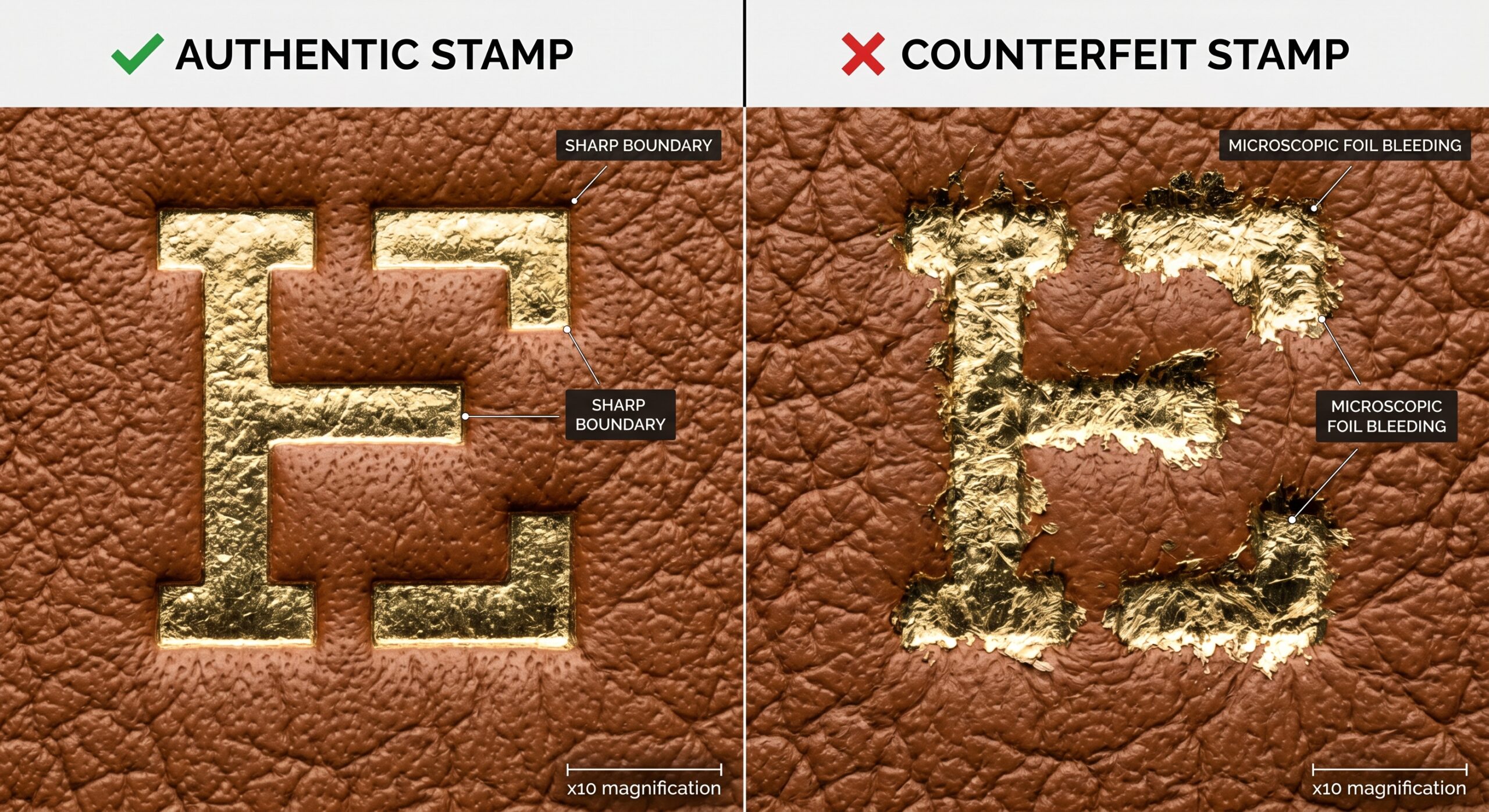
The gold foil on an authentic Hermès stamp adheres to the leather surface at the precise temperature that balances two competing requirements: hot enough to activate the adhesive and create a strong bond, but not so hot that it causes the foil to flow beyond the die boundary. The result is a foil edge that is clean and sharp — the gold film stops exactly at the letter boundary with no microscopic bleeding or feathering of the film beyond the letterform. On counterfeits using incorrectly calibrated hot-stamping equipment, the temperature imbalance produces one of two failure modes. Over-temperature: the foil bleeds slightly beyond the letter edge, producing a microscopically fuzzy outline that is legible under ×10 magnification as a soft rather than sharp foil boundary. Under-temperature: the foil adhesion is incomplete, producing letters where portions of the gold film have not bonded to the leather and appear as dull, non-reflective patches within the letterform. Both failure modes are consistently present in counterfeit stamps and entirely absent in authentic ones.
Foil colour consistency across the full text block is the final physical property to assess without magnification. Authentic Hermès foil uses a warm, mid-gold pigment that is consistent in tone across every letter in the stamp. Under natural daylight, the foil reads as a single, even tone across the full text. Under angled artificial light, it reflects with equal intensity from every character. Any variation in gold intensity within a single stamp — individual letters appearing brighter or more yellow than their neighbours, patches of duller gold within a letter, or a general variation in the foil's warmth across the text line — indicates either counterfeit production with inconsistent foil quality, or damage to an authentic stamp from improper cleaning with a solvent that has partially stripped the foil. For complementary authentication markers including the saddle stitch angle that should be verified alongside the foil stamp, see Hermès Authentic Saddle Stitch Angle vs Machine Stitching. For blind stamp depth comparison, see Hermès Blind Stamp Location Changes in 2026.
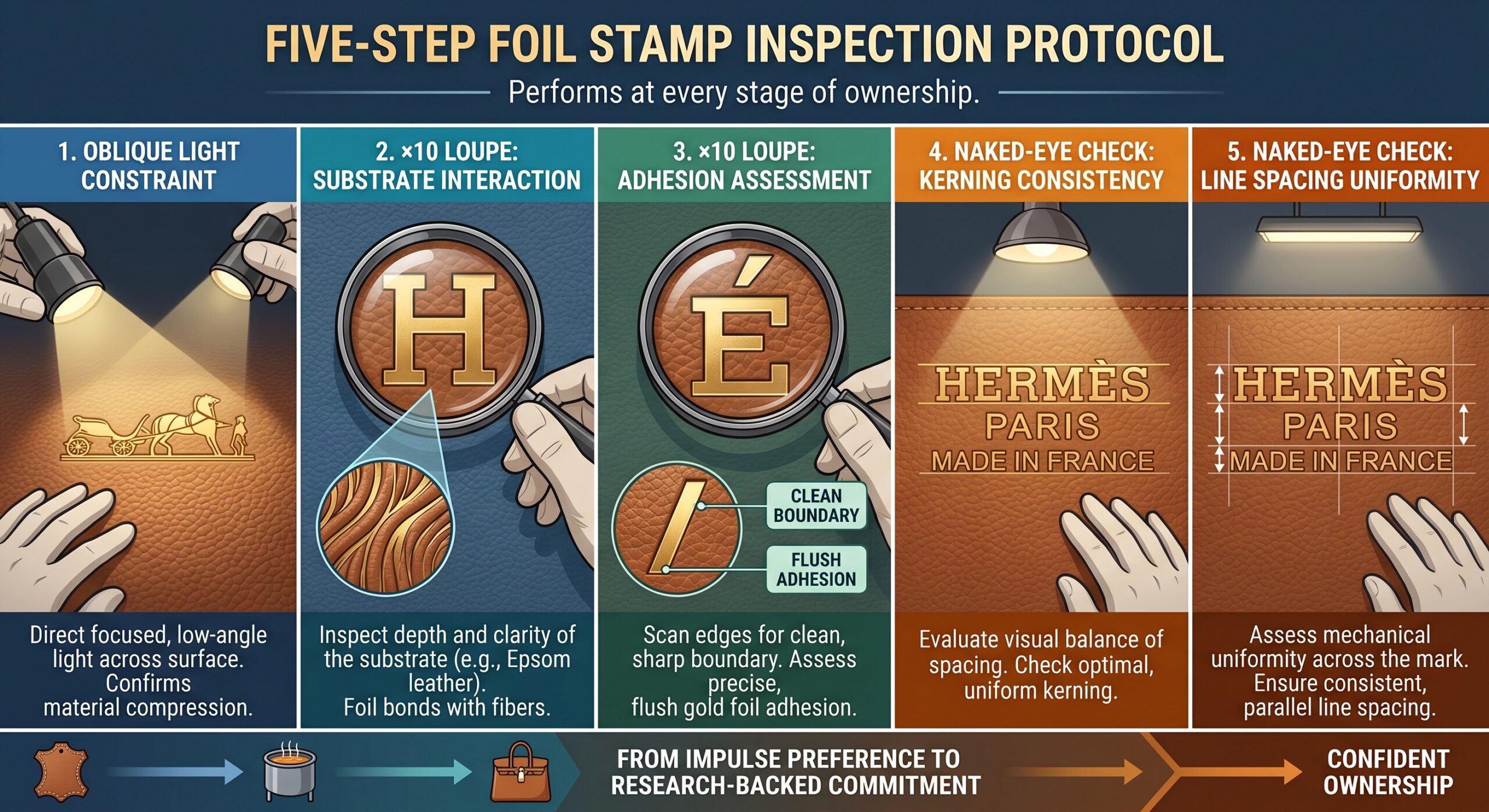
The Foil Stamp Inspection Protocol: Five Steps Under a Loupe
The following protocol integrates foil stamp inspection into a complete authentication assessment, covering all four dimensions of the mark — position, letterform geometry, impression depth, and foil adhesion quality — in a systematic sequence that takes under three minutes with a ×10 loupe and a directional light.
Step 1 — Position verification. Confirm the stamp appears on the correct surface for the bag model. On the Birkin: exterior front panel, centred below the turn-lock closure hardware, approximately one-third of the way up from the bag base. On the Kelly: interior leather panel visible when the bag is opened, not the exterior. A stamp on the wrong surface is an immediate authentication failure regardless of all other properties. Confirm the text reads "HERMÈS PARIS" on the first line and "MADE IN FRANCE" on the second — any variation in this text, including missing accent on the É, incorrect spacing, or different word arrangement, is a counterfeit marker.
Step 2 — Oblique light depression check. Hold a single directional light source at a very low angle to the stamp surface. Confirm that each letterform sits in a shallow depression relative to the surrounding leather surface. Confirm the depression depth is consistent across the full text block. Note any individual letters that appear flat or unusually deep relative to neighbours.
Step 3 — Letterform analysis under ×10 loupe. Assess the É accent angle (authentic: ~45°, not touching cap height), the R leg angle (authentic: extends beyond optical boundary at controlled angle), and the H crossbar position (authentic: slightly above centre). If any of these three characters show the failure modes described in Section 2, treat the piece with strong suspicion regardless of other factors.
Step 4 — Foil edge adhesion assessment. Under ×10 magnification with oblique light, examine the foil edge along the bottom of three or four letters. Authentic: clean, sharp foil boundary with no visible bleeding beyond the letterform edge. Counterfeit: either soft/fuzzy edge (over-temperature) or dull patches within letters (under-temperature incomplete bond). This assessment can also be made by examining any letter that shows slight gold wear — authentic worn foil reveals clean leather beneath the letter; counterfeit worn foil reveals irregular patches.
Step 5 — Kerning and line spacing consistency. Step back from the loupe and look at the stamp with the naked eye under natural light. The stamp should read as visually even — no character pairs that appear crowded or gapped, no individual letters that sit higher or lower than the text baseline, and consistent line spacing between the two text lines. Any character pair that immediately draws the eye as irregularly spaced is worth examining under the loupe for letterform and foil quality. Browse the full authentication category at Authentication, and for resin edge glazing authentication as a parallel craftsmanship marker see Authentic Hermès Resin Edge Glazing Thickness.
| Property | Authentic Hermès Stamp | Counterfeit Stamp | Inspection Method |
|---|---|---|---|
| Stamp position (Birkin) | Exterior front panel, centred below hardware, ~⅓ up from base | Correct position on most high-tier fakes — not a reliable standalone marker | Visual, no tools required |
| Stamp position (Kelly) | Interior leather panel — NOT exterior | Some fakes stamp exterior of Kelly (Birkin-style) — immediate failure | Visual, no tools required |
| É accent angle | ~45°, positioned above cap height without touching — consistent across all examples | Too shallow, too steep, or touching cap height line — most common single character failure | ×10 loupe, oblique light |
| R leg geometry | Extends beyond optical right boundary at specific controlled angle | Leg too contained or at incorrect angle relative to bowl junction | ×10 loupe |
| H crossbar position | Slightly above centre — specific to authentic Hermès die | Centred (standard commercial roman H construction) | ×10 loupe or careful naked eye |
| Impression depth | Consistent shallow depression under each letterform — legible under oblique light | No depression (cold transfer) or inconsistent depth across letters (uneven die pressure) | Oblique light at low angle to stamp surface |
| Foil edge adhesion | Clean, sharp boundary — no bleeding or feathering beyond letterform | Soft/fuzzy edge (over-temperature) or dull patches within letter (under-temperature) | ×10 loupe, oblique light |
| Foil colour consistency | Warm mid-gold, even across all characters — no tonal variation within the stamp | Variable gold intensity within single stamp; individual letters brighter or duller than neighbours | Natural daylight, naked eye |
| Kerning | Consistent character spacing throughout — no crowded or gapped pairs | M-È and A-R pairs most commonly show inconsistent spacing | Naked eye, natural light, step back from bag |
| Line spacing | Approximately 1.5× cap height between "HERMÈS PARIS" and "MADE IN FRANCE" baselines | Compressed or expanded relative to authentic — most visible when comparing alongside reference | Ruler or reference comparison |
The É Is the Most Reliable Single Foil Stamp Authentication Marker — Start There, Then Work Through the Physical Layer
Among the ten authentication dimensions of the Hermès foil stamp, the É accent angle is the single most reliable first-inspection point: it is consistently wrong on counterfeits, it requires only a ×10 loupe to assess clearly, and it is specific enough to the authentic die that no commercial typeface or counterfeit replica has yet produced it correctly across a full production run. Start with the É. If it fails, the piece can be excluded without proceeding further. If it passes, proceed to the R leg, the H crossbar, the impression depth, and the foil edge adhesion — building a multi-marker assessment that is substantially more reliable than any single point alone.
The foil stamp is not the most structurally complex authentication marker on a Hermès bag — that distinction belongs to the saddle stitch angle and the hardware pearling. But it is the most accessible: it requires no disassembly, it is always visible on the exterior of the piece, and it can be assessed in a well-lit room with a loupe that costs less than ten pounds. For buyers who learn this single skill before committing to a secondary market purchase, it provides immediate, reliable value.
Bottom Line: Check the É accent angle first — it fails on virtually every counterfeit currently in circulation — then verify impression depth and foil edge adhesion under oblique light to complete a foil stamp authentication that takes under three minutes and requires no specialist equipment beyond a ×10 loupe.
Popular Searches
Explore our most searched Hermès foil stamp authentication combinations
The foil stamp on Gold Togo is highly legible — the warm leather tone provides strong contrast for the gold foil, making É accent angle and impression depth assessment particularly clear.
⬆ TrendingThe Kelly's interior stamp position on Noir Epsom creates high contrast foil visibility — the compressed Epsom grain within each letterform depression is the clearest physical authentication marker on this leather.
★ Collector FavouriteCraie's pale surface creates the most demanding foil colour assessment condition — the warm mid-gold reads as slightly more yellow against white, making foil tone consistency the most critical marker on pale leathers.
◆ Ultra RareOn aged Barenia, the foil stamp depression becomes more pronounced as the surrounding leather darkens with patina — making the impression depth marker increasingly legible over years of carry.
⬆ Rising DemandClemence's softer grain creates a slightly different foil impression texture — the kerning consistency check is particularly important on Clemence as the softer surface can make individual character assessment less immediate.
🔥 Most SearchedThe retourne Kelly's interior stamp is the most commonly inspected on the secondary market — the warm Togo Gold leather and the interior position combine to make all five protocol steps clearly executable.
Frequently Asked Questions
Authentic Hermès foil stamping should display consistent letter height throughout the full text line, even kerning between each character, and a gold foil that sits flush with or very slightly below the leather surface rather than sitting proud of it. The letterforms are specific to Hermès's proprietary die: the H has a slightly elevated crossbar, the accent over the É is precisely angled at approximately 45°, and the overall character weight is consistent. Under magnification, the foil shows clean, sharp letter edges with no bleeding or fraying at the foil boundary. See the full authentication guide at the Authentication Guide hub.
The foil stamp impression creates a very slight depression in the leather surface — the heated die compresses the fibril layer beneath each letter, creating a clean, shallow indent legible as a slight shadow under oblique light. This depression is considerably shallower than the craftsperson blind stamp impression — approximately half the depth on Togo. A stamp with no depression (cold-foil transfer) or inconsistent depression depths (uneven die pressure) is an authentication concern. For blind stamp depth context see Hermès Blind Stamp Location Changes in 2026.
On the Birkin, the foil stamp "HERMÈS PARIS MADE IN FRANCE" appears on the exterior front panel, positioned centrally below the turn-lock closure hardware, approximately one-third of the way up from the bag base. On the Kelly, the foil stamp appears on the interior leather of the front panel, visible when the bag is opened — not on the exterior. This interior vs exterior positioning difference between Birkin and Kelly is itself an authentication marker — a Birkin-style exterior stamp on a Kelly is incorrect. For saddle stitch context see Hermès Authentic Saddle Stitch Angle vs Machine Stitching.
Authentic Hermès uses a warm, slightly muted mid-gold foil — not a bright high-chroma yellow-gold and not a pale champagne. The foil is consistent in tone across every letter in the stamp with no variation in gold intensity within a single stamp line. Any variation — individual letters appearing brighter or duller — indicates either counterfeit production or authentic foil damaged by improper cleaning with solvents. Browse all authentication content at the Authentication category.